
Swiggy's group order feature lets multiple people add to a single cart — but the experience is fragmented, confusing, and prone to mid-flow drop-offs. The challenge: make group food ordering feel as effortless as ordering for one.
The redesign focused on three friction points — initiating a group session, tracking what others have added in real time, and managing the final order before checkout.
Creating a group order required too many steps and unclear affordances. Users often didn't know how to invite others or where to find the feature. Redesigned with a prominent entry point and a one-tap share flow.
Members had no live view of what others were adding. This caused duplicates, confusion at checkout, and order abandonment. Solution: a live "what everyone's adding" panel with name attribution.
The final review step before payment was a single user's responsibility with no visibility for the group. Redesigned with a shared review state and a "ready to order" signal from all members.
Conducted a heuristic audit of the existing Swiggy group order flow. Identified 6 usability violations. Benchmarked against DoorDash and Uber Eats group features.
Explored 3 approaches for the real-time cart view — a floating panel, a split-screen layout, and a bottom drawer. The bottom drawer won in usability testing for thumb accessibility on mobile.
Delivered annotated flows, component specs, and a full prototype in Figma. Documented edge cases: what happens when a member leaves mid-order, payment split scenarios, and timeout states.
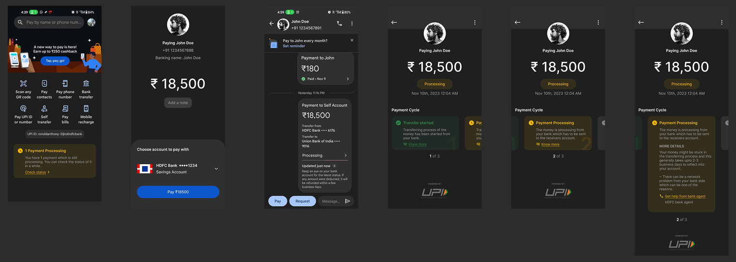
In India, a significant portion of UPI users are first-generation smartphone users — people who transitioned from cash to digital payments without a strong foundation of digital trust. When a Google Pay transaction gets stuck in "Processing," there's no feedback, no timeline, no explanation. For these users, that silence isn't a minor inconvenience — it's panic.
The redesign focused on one psychological insight: if you can show a user exactly where their money is and what's happening step by step, the fear disappears. Transparency is the feature.
The existing "Processing" screen shows a static label and nothing else. Users have no way of knowing if the money left their account, if it's with the bank, or if it's reached the recipient. For non-tech-savvy users, this ambiguity feels like loss.
When something feels wrong, users need a clear next step. The current UI offers no in-context way to contact their bank or raise a concern — forcing them to exit the app, call a helpline, or simply wait in anxiety.
The processing state is the highest-stakes moment in the payment flow. A blank screen communicates nothing — and for first-generation digital users, "nothing" reads as "something went wrong." The redesign makes that moment the most reassuring part of the journey.
The research phase focused less on the technical payment flow and more on the emotional state of the user during it. Interviews with low-digital-literacy users in Tier 2 and Tier 3 Indian cities revealed a consistent pattern: prolonged processing = assumed money loss. The fix wasn't speed — it was communication.
Designed a live payment timeline that shows each stage as it happens — Transfer Initiated → Bank Processing → Reaching Recipient — with plain-language descriptions at every step. Alongside it, a contextual "Get help from bank agent" shortcut surfaces only when the payment has been processing beyond the expected window, giving users a direct escalation path without leaving the flow.
Tested the redesigned processing screen with the same Tier 2 user cohort. Participants consistently reported feeling "more in control" and "less worried" compared to the current experience. The timeline format — borrowed from familiar experiences like delivery tracking — gave users a mental model they already trusted.
"For millions of Indians, digital trust isn't given — it has to be shown."