Most people have no idea how many subscriptions they're paying for. Services auto-renew silently, spending adds up invisibly, and by the time you notice — the money's gone. SubNest was designed to fix that.
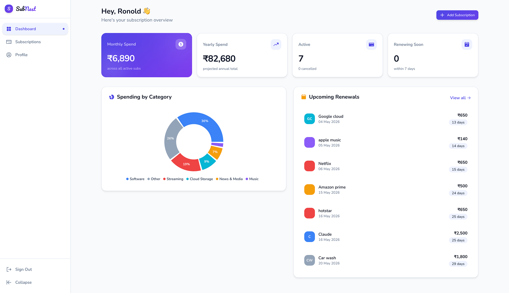
The goal was simple: build a product that gives you complete visibility over your subscription spending — what you're paying, when it renews, and whether it's worth it.
"The average person is unknowingly subscribed to 12+ services they barely use."
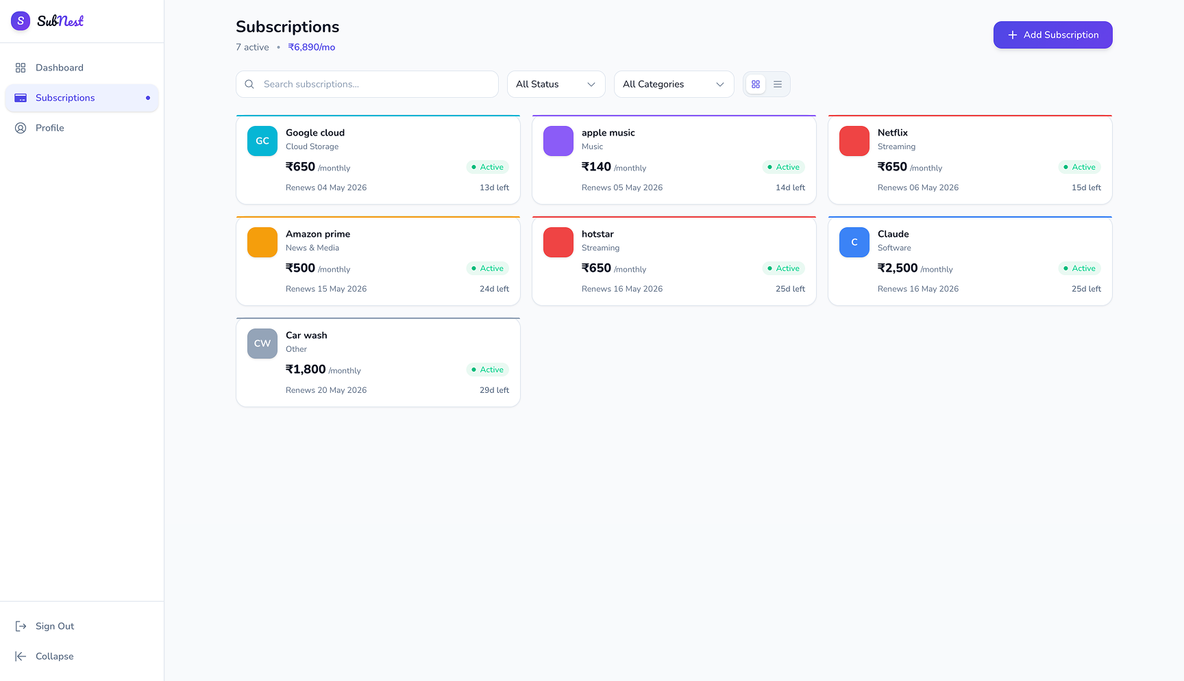
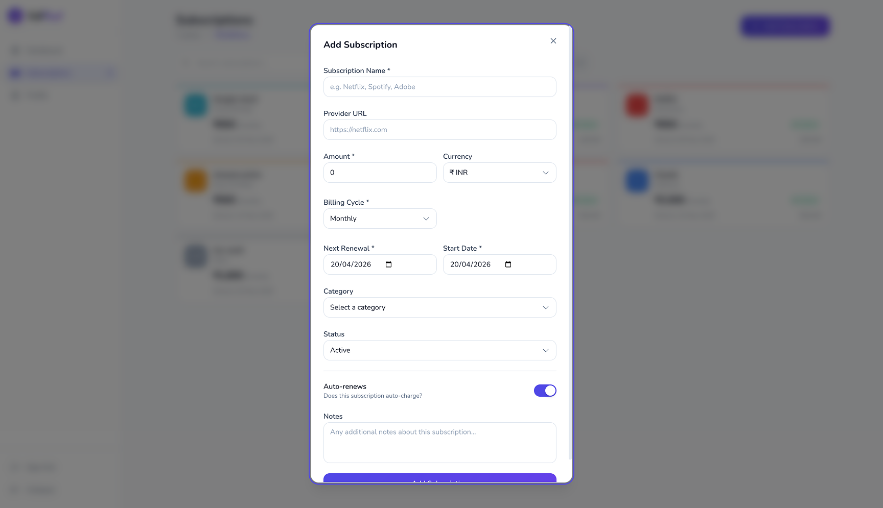
A live calendar view of all upcoming renewals with smart notifications sent before each auto-charge — never get surprised by a bill again.
Visual breakdowns of spending by category, time period, and service — so users can see where money is going at a glance.
Proactive notifications for renewals, price increases, and underused subscriptions — nudging users to act before it's too late.
A lightweight tracking system that scores each subscription's value based on usage frequency — helping users decide what's worth keeping.
Started with stakeholder interviews to understand the core problem. Competitive analysis across Truebill, Rocket Money, and native bank apps revealed a gap — nobody was making subscription data feel human. I mapped user journeys and defined clear problem statements before opening Figma.
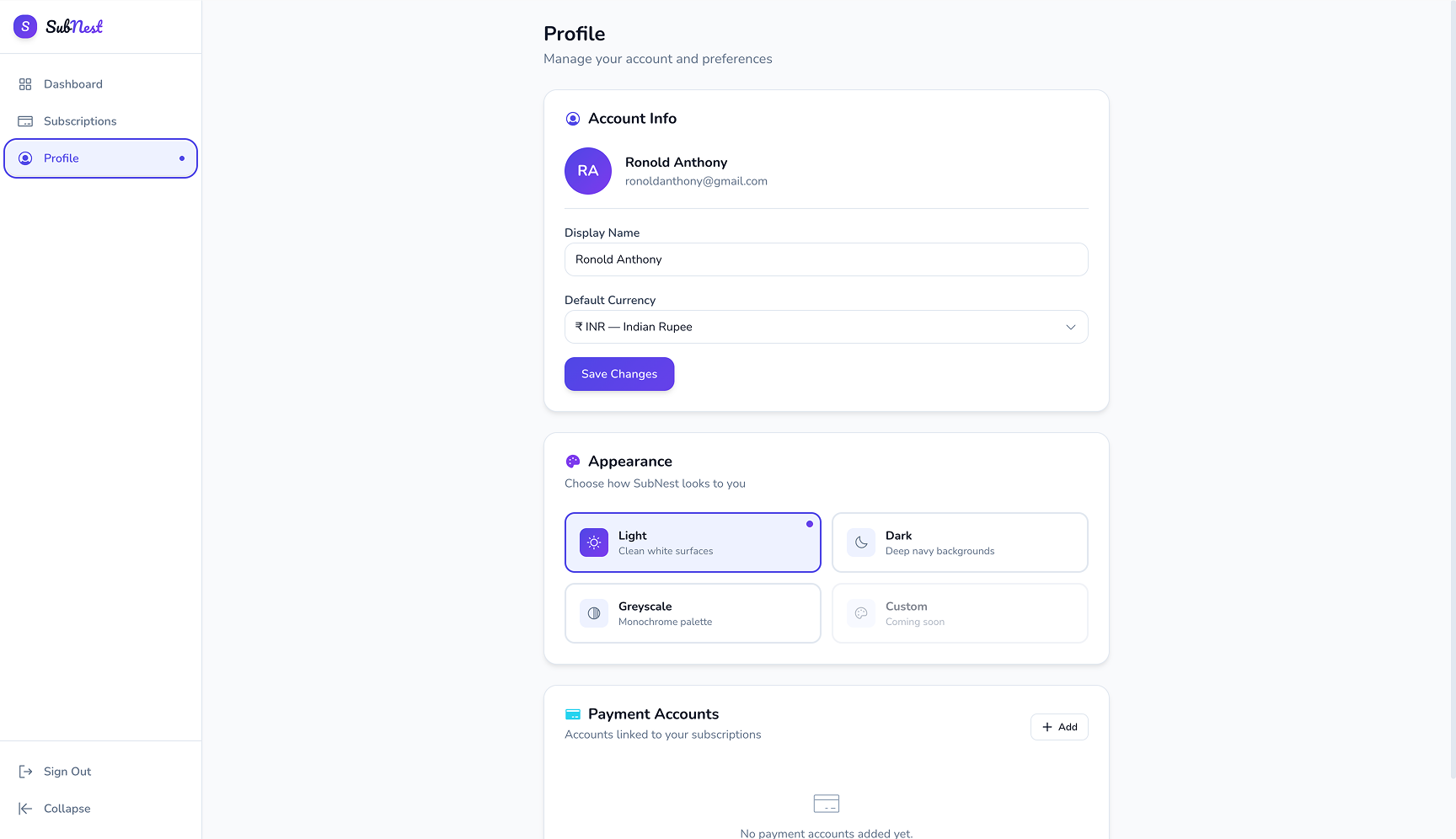
Went from lo-fi wireframes to high-fidelity UI across 3 major iterations. Key decisions: a dark-first design language (money feels more serious in dark mode), a dashboard-led IA so users land on their most important data immediately, and a colour-coded status system for renewal urgency.
Delivered a complete Figma file with component library, interaction specs, and developer annotations. Stayed involved through build QA — reviewed components in staging, caught 12 visual inconsistencies, and ensured the motion design matched intent before launch.